Showing posts with label Dichotomy. Show all posts

Saturday, 24 January 2015

Texturing


 I textured the hand and face in Z-Brush. Even though I was pushed for time with this project I still wanted to learn new processes. I used an amazing feature of Z-Brush called Spotlight. This allows you to place an image over the top of your geometry and then project the image onto it via poly painting. This is actually extremely efficient.


 I also quickly textured the hands in Z-Brush and backed this detail onto a texture sheet.

This combined with improved texturing techniques resulted in really quite successful textures. Whilst texturing I made shore to keep all the different details on different layers. This way for example after applying the mud to the albedo, I could then grab the layer with only the mud on it and create a height map (which would be fed into crazy bump) from it so that all the mud would actually protrude from the surface. This black and white information for just the mud could then be altered and added to the Roughness.


 I did begin to model some hair, which I was going to give a natural fall to via the cloth modifier. This looked like it could have been a successful process but I ran out of time.


 During this project I have learnt allot about the cloth modifier, I have also learnt a new process via Z-Brushes Spotlight system. I have improved my skill in general Z-Brush Sculpting and texturing and I am happy with the face I created.


The general finale mesh as it sits right now fully textured over all is still in my opinion really quite appalling. No matter how well I had textured the model it was never going to save the coat.

Design wise I actually do really like these two characters and their dichotomy.

Big, scary, invulnerable, powerful, imposing alien.


Venerable, relatable, little girl. 

If I was to do this project again, I would stick with my first designs. That way I would have had an extra week to truly create something amazing. Those characters showed off a greater ability to design and they were more interesting when you were only viewing one of them. They were also more dynamic. They were more interesting and had more points of interest.


If I had done what I wanted to with this project, I would have a portfolio quality piece right now. Also I would have a portfolio piece relating to character design and modelling and texturing, which I currently do not have a single example of. Also now if I want to create a piece that demonstrated this I will have to do it in my own time as we do not have another character project this year. 


The Impossible Coat


I started experimenting with the Cloth Modifier, and got really excited with the realism I could simply achieve using it.


I quickly modelled the bombs as they would sit under the coat, my intension was to then drape fabric over the model, which would conform to the model and bombs underneath, creating a realistic coat.

 After my initial excitement over the potential of the cloth modifier, I quickly realised how difficult this task was going to be.

The cloth would hang too stiffly, or to loosely, it would intersect, bunch up etc. Many many problems. I managed to solve a whole bunch of these, but then just found more.


In the end I had to simply call it quits and use my least unsuccessful attempt.

The finale coat was made by modelling the majority of the coat using symmetry, I unwrapped the coat at this point. Then I moved this about so that it was not intersecting with any other meshes. I turbo smoothed this and then, used the cloth modifier to drop this only slightly onto the model. I may have relaxed parts of the mesh at this point to remove bunching. I then exported this mesh as the high poly coat. Then with edges selected double clicked on every other edge in order to select an entire loop, then by holding Ctrl and back space I deleted these loops with their corresponding vertexes. I reduced this high poly coat down to as fewer tries as a felt I could without losing the silhouette. The resulting mesh was then exported as the low poly coat. Using these two meshes I then created a normal map, via backing in X-Normal.

 It was during this tri reduction process that I mad the worst mistake of this project. This process would have created N-Gons, I should have gone back into the Low poly geometry and altered the mesh to remove these at this point.  Stupidly I totally missed this step in my process, so this was not done. I then dived head long into texturing and didn’t realise that I had forgotten to do this until after finale hand in.


Modeling the Character


I started modelling with the boots, I started here simply because I wanted to get my teeth into something and I could easily get references quickly. 


I modelled the boot to a ridiculously high standard, even modelling the laces. But here using the magic of projection mapping I was able to cut several hundred tries out, with no loss of detail. The laces now reside on a single plain with a handful of connection going across it. Above you can see the original boot, the projection plain with the laces above it and then the finished boot.


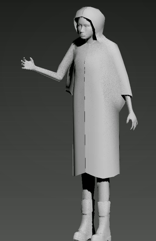
I then modelled a very low tri body, this would be covered up, so it’s just their as a reference for constructing the coat, and to support rigging of the character. 


I then modelled the head separately 


The hands were modelled onto the body. I unwrapped everything as I modelled it. Everything up to this point has already been unwrapped. The hands were unwrapped with symmetry on so I only had to unwrap and texture one.  All the unwraps will be joined together later.


I then moved onto modelling the coat. A t first I was simply trying to model it traditionally. Started with a very simply box, and added swift loops. I also toyed with the idea of there being a bag, on her back under the coat, but this didn’t last very long.  Modelling the coat like this was extremely difficult, inefficient and probably would have yielded an extremely wooden result. I felt that the coat probably wouldn’t have hung properly. 

As you can see I have also put the character into a very simple pose. This was not a professional decision. I should have finished modelling and then rigged the character prior to posing. I did this because it was extremely quick and easy to simply move one arm up into the position I wanted and then just slightly adjust various points of the model to break the symmetry a bit. Yes this is an unprofessional way of doing this but I didn’t want my finished character standing in the T-pose  I wanted to put all my time into modelling and texturing. 

Feed Back 2

  •  It’s not obvious that she’s carrying bombs; it could simply be read as a fisherman’s wife. In the games industry you do not have a lot of time to get across what you’re trying to say. If she is carrying bombs then stick a load of dynamite in her hand.


More Design


·        
Here I have given her a more obvious detonator and some unexploded ordnance to carry on her back.  Also as a stretch goal I thought it would be nice if she was carrying a third point of interest. But this time something sweet, nice, something to add some history, life and emotion to the character, for this I have added a necklace with a pendent.  


Second Character Design


I had already decided that I wanted the second character to be human, this was due to this being apparently our only character project of the year, so I should use this rare opportunity to better my human character modelling skills. At this point I have only ever sculpted one human, and this being an extremely difficult task I need all the time in this area as I can get. 

I also actually have an idea, plot, relationship between the characters that I am going to be designing to.

We aren’t meant to delving into this side of things, but I like giving my characters purpose, I struggle to see how you can design from a blank slate.  Especially when at this point I have already established another character, which this character has to live in the same world as. 

It’s still a simply setting though, no complex back story.

The woman (it’s going to be a female) has been in hiding from this alien (and or alien species), she is part of rebellion that is struggling to fight back. She is not military

This girl has given up all hope, so as a last resort attack she yields to the alien simply to get close to it. Her intension is then to blow herself up, killing herself and hopefully also the alien.

 Mood Board


I liked the idea of the girl wearing a traditional yellow rain coat. Its relatable and also nostalgic to children’s stories. One of the re accruing pieces of feedback we all received, was that we had all designed attractive, white, skinny 20 ish year old characters. So here I have looked at how I could place this idea in Africa.

Silhouettes


The best silhouettes here are the African ones. After looking into this further and discussing it with peers, I realised that if I am going to design what is basically a suicide bomber she will have to be white. This is due to the current world political climate. Obviously all nations, and all nationalities and ethnical groups have used such methods of attack, currently prejudice is aimed at those of colour. So if I was to create an African suicide bomber many would simply view it as a terrorist. I’m only saying this because I know people that would consider anyone who is not white or Asian, as a terrorist even when they are not carrying a bomb. So because of this existing ignorants , if I am designing a suicide bomber who is not meant to have any connection with today’s political climate she must be white and or Asian and western in her appearance.  I’ve included Asians here because I don’t think even the most ignorant of people would relate Asians to what’s happening currently between the west and the middle east (well mostly the middle east obviously it’s a worldwide, movement also taking part right across western countries themselves and including people of western heritage).

Quick Further Development

I spent to long working on the alien design and have no time left for design, especially when I take into account the quality of finish I want to achieve with this character. So I have had to compromise allot. I need a design that will be simple to texture to a high quality. So a design with only a handful of materials for me to nail.


Because of this I picked the large raincoat idea. The rain coat will cover her entire torso, thus I will not have to design, and then model and texture, a shirt, trousers and an explosive vest for example. 


I still toyed with other designs, but had to come back to the large yellow rain coat. I added wires to insinuate a large amount of hidden explosives, and a detonator. I do think this design was the best choice regardless of time constraints. Something about the bright yellow rain coat is really nostalgic of a better more peaceful time for this character, especially when paired with some playfully coloured boots.


Monday, 22 December 2014

Character Project: Take Two

Extremely condensed design process

I have two weeks to design two characters and then model and texture one character. Normal I try and split projects into three groups Designing, modelling, and texturing. This gives me under 5 days to design two characters. 

Random  Shapes


Here I tried to simply drop random dichotomous groups of shapes with the intension of creating characters. I tried not to delve into the who, what, when where of the characters, but found this extremely difficult. I found that I had to give my characters purpose, a world, story, character. Although the ideas I came up with were extremely simply, they did exists, so I failed at the first hurdle here. These ideas though are not set in concrete; they were constantly changing throughout this process.

I found this generally extremely unsuccessful, but it was fun and interesting to see what I could come up with such limited ref.


Mood Board


I decided at this point that the basic shapes that I had been using were to limiting. The design looks quite insect like so I went onto pinterest and started searching for interesting ref.

The small moth, fly like insect on this board with the elaborate head dresses are called Tree Hoppers and they are amazing.  


I used the quick selection tool in Photoshop to grab random silhouettes from the insects. I then started simply mashing these with the best of my previous silhouettes.  I was really pleased with the way this was going.

Further Development

Here I had kind of settled on an idea, I wonted this giant alien to be obviously evil and dangerous. I also wanted to create a relationship reminiscent of the one below involving both my characters. 

(The Iron Giant)

So a giant powerful, alien evil character, and a venerable, relatable, small, insignificant other character.

This meant creating natural, alien forms that would read as weapons, ranged weapons at that, but without jumping to guns. They would have to be natural in form, but still read as a source of power although there is very little in nature like this.


 Further Development


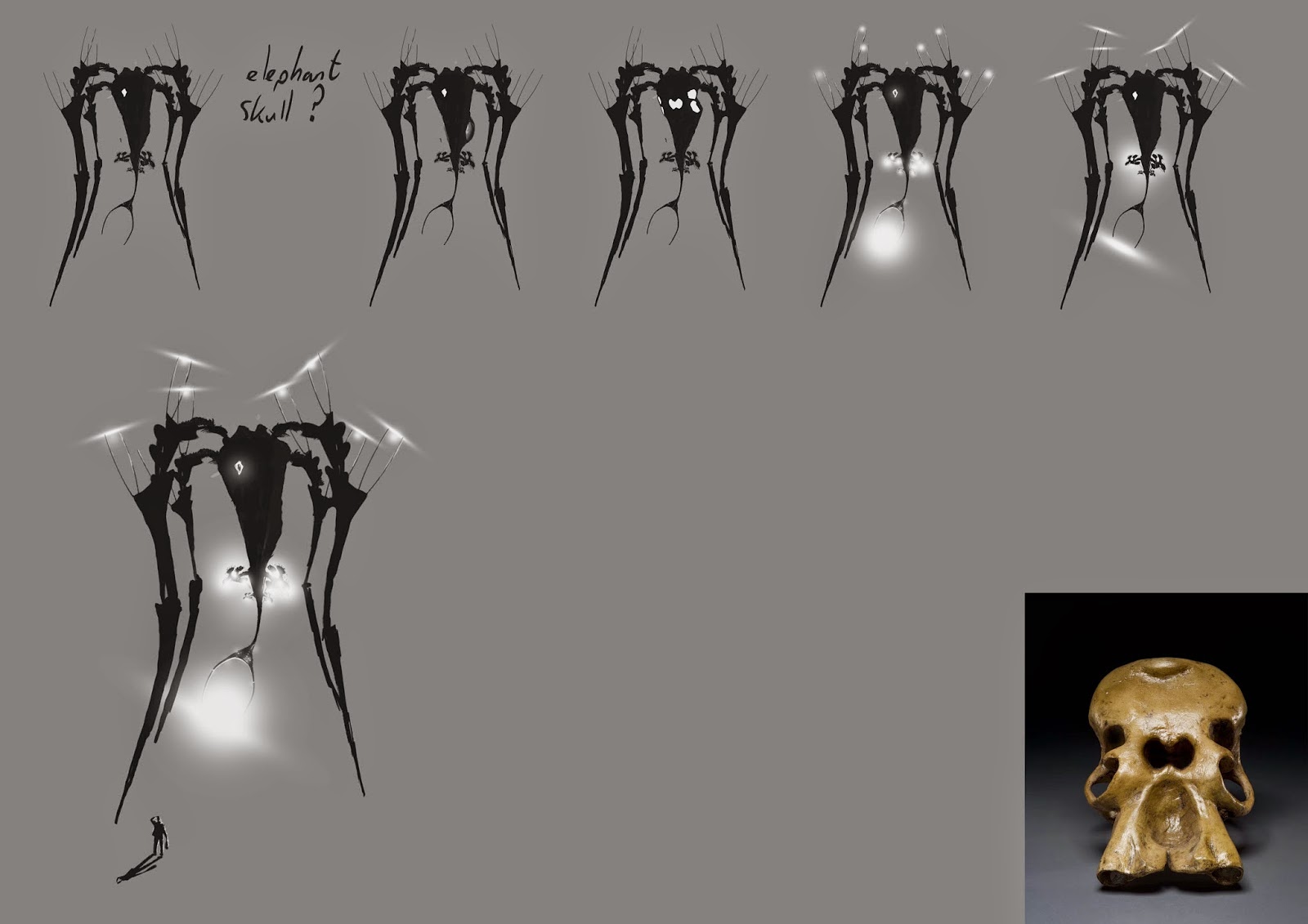
At which point does a character become so alien that it’s not a character anymore?  Because of this thought I briefly tried to make the main body of the alien more skull like, using the elephant skull as reference. I decided that if the single hole at the front of the alien was an eye with a pupil, then this would be viewed as a living, creature.   


Saturday, 29 November 2014

Dichotomy 3


Presentation

I presented all the work I have done up to this point for this project.

Feed Back (Not all personal, but all feedback should be taken on board, as we are all trying to get jobs in the games industry)

  • The characters are not obviously rich or poor.

  • The characters look the same

  • I need to ground the characters to make them             believable, their contrasting back stories and how this would affect their appearance.

  • Their physical forms should be different e.g. he could be fat because he is rich.

  • This is a character design project; it’s not about the quality of the 3D model.

  • You will get a much better mark if you model both characters.

  • The 3D model should be a portfolio piece.

  • Don’t use Z-Brush

  • When designing animals cover them up because nude animals are perverted.

  • Don’t design Foxes

  • Don’t design characters set in the future, because you can’t predict what it will be like and you will get it wrong.

  • My character was basically Adam Ant, who is a pop star from the 80’s, so it’s not futuristic.

  • Needed more silhouettes, before picking one to develop.

  • Don’t have a back story, this project it all about the visuals. Simply design from basic shapes, when you have found some cool dichotomous parings of shapes, paint over these. Try and pick out a character, simply try and make them as dichotomous as possible. Then do a Value pass, a colour pass, and then model both characters. At no point should you consider anything more than their appearance.

  • Any deviation from realistic skeletal and muscle forms will make your character impossible and there for unbelievable.

  • Character design is not fashion design.

  • If you nail your design in one silhouette that is fine.

  • The best examples of character design that you could look at are the Simpsons, Pixar and No One Lives For Ever 2.


 I could not hold the Simpsons or Pixar in higher regard, but I do think that if I had presented these designs they would have been torn apart, due to their anatomic inaccuracies. They are extremely stylised. Allot of the negative feedback we received was in relation to impossible  anatomy, even when students pointed out they  were designing a character for the Dota 2 Universe for example. 


Pudge from Dota 2


Also if we were to design characters in a stylised fashion, this contradicts something you are always told throughout all art and design tuition. Master realism before you start stylising your work, this has always been the case. Stylising is extremely difficult, and will only be done badly without a firm grasp on realism. 


The same can be applied to No One Lives For Ever 2, also here there is a generic sexualised female character. This game also plays on the fashions of early spy movies, so here we have an example of good character design that embodies  3 design traits we have been criticised for implementing in our own designs, Sexualising Female characters, fashion design and impossible stylised anatomy.

Lot of the point brought up are valid criticisms, I definitively should have done allot more silhouettes.
Some of the point will make me question the design and how it should be pushed, for example the guy does look like Adam Ant, weather this is a look I need to stay away from can now be determined via more design.

But some of the point brought up are highly questionable. I think the point that animal characters shouldn't be nude as this is unsavory, to be ridiculous. All animators have been designing family friendly characters like this for years, and animals in real life are not covered up. Their is absolutely nothing sexual about an animals uncovered body, if anything the idea that it is, is what is perverted here. 

Conclusion

I completely went about the project in the wrong fashion although we were not given a strict path to follow; we were simply given the word Dichotomy and told that anything goes, when actually we needed to follow an extremely strict system. It’s the ends not the means is what we are normally told, when actually for this project it’s the means that was important and not the ends.

What I need to do is follow the guide line we have been given, although my work up to this point has been viewed by my tutors and pears it appears that actually it is inappropriate for this project.

Don’t have a back story, this project it all about the visuals. Simply design from basic shapes, when you have found some cool dichotomous parings of shapes, paint over these. Try and pick out a character, simply try and make them as dichotomous as possible. Then do a Value pass, a colour pass, and then model both characters. At no point should you consider anything more than their appearance.

This is the path I am now going to try and follow. This extremely demanding 3 week project which we started on the 5thday now has 2 weeks left and I’m having to start again.


Wednesday, 26 November 2014

Dichotomy 2

Condensed Design Process

Silhouettes

Here have simply used the quick selection tool to grab shapes from the mood boards and I'm mashing them together.


Here I was really happy with some of these designs. I still have some big decision to make, Will the girl be carrying a gun and how much should I be relating the two characters etc.


Here I’ve compiled the best of both silhouette sheets, to compare them side by side. I think they mostly work, they are obviously from completely different worlds (Rich/clean/spoilt and Poor/rough/dangerous), but yet due to certain design cues (clothing style) I think they still relate. 

The poor character still needs to be pushed, the long cloak need to be altered as the rich character also has a long cloak. All so I’m still not shore how feminine if at all I want this character, I kinda want it to be a surprise that this tough looking character (exterior) is actually a young possibly awkward young girl (Grew up in the wrong world).

Paint Overs


I jumped straight into some paint overs, after the brief silhouette period. I felt that there was still development to be made there, but I had to move on. I thought that this silhouette could already be developed up into a good design, so I decided to run with it. I still think some development will need to be made post these paint overs. The boots need tweaking, I've tried to make some ultra-modern, yet relatable “cool” young person shoes, but I think I've gone too far. Though there are some good ideas here, their basically an exaggerated high top, and skate shoe combo. 


With early to mid 2000 skate shoes (Above) the cool thing was super wide, super big tonged shoes (the tongue would distort the silhouette of the shoe, the aim being make the front steep) If you push this as I have with my design, you end up with the tongue at an inverted angle.  My design is also a knee high, high top, but yet the heel is still at standard high top height. This chunky shoe design should Juxtapose nicely with the female character as I plan on giving her a light pair of skin hugging shoes, for being nimble and agile (stealthy) .


Allot more development is needed here although I am really excited with where this character will end up. There are allot of good ideas I just need to pick and choose which ones to bring forward.

I like the smaller half water proof from the first, its silhouette, the trousers and the bag.

I don’t like the skirt in the second, nor the strong contrast between lights and darks I have tried here.

 I do like the cape in the third although I think it hangs to similarly to the Rich characters coat.

I like the way the mask in the fourth encompasses a lot more of the head, I don’t like the trousers, the parachute pants from the first are allot more dynamic, also I don’t like the stance I prefer the femininity of the first stance (although the stance is quite a bit to feminine, and the knees coming together is confusing the silhouette a bit).